InsurePay
An insurance platform built around a single idea: pay your premium, get all of it back as something you can actually spend.
Insurance is important.Renewal isn’t exciting.
People buy insurance because they should, then spend a year not thinking about it. Renewal arrives as an annual chore with no upside, and the research bore that out.
They forget
Users often forget to renew policies, which lets cover lapse.
It’s tedious
Buying or renewing a policy was found confusing and tedious.
Nothing brings them back
Once a policy is bought, nothing motivates anyone to keep engaging with it.
So the opportunity wasn’t only to make renewal easier.It was to give people a reason to come back.
Turn an obligation into a reward.
- Pay
- 100% cashback
- Coupon
- Redeem
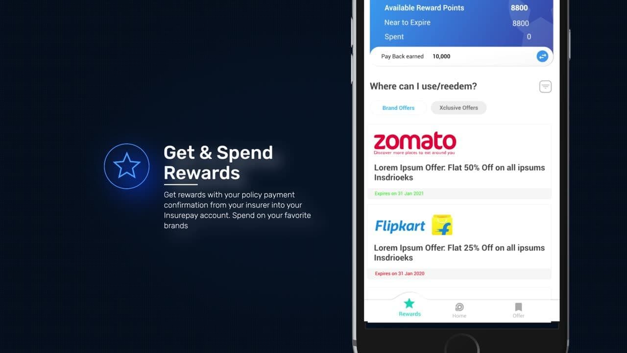
Pay the premium you were going to pay anyway. Get the whole amount back as points, and spend them where you already shop. The policy stops being a cost and starts being a purchase.
Make the important things obvious.
Pay
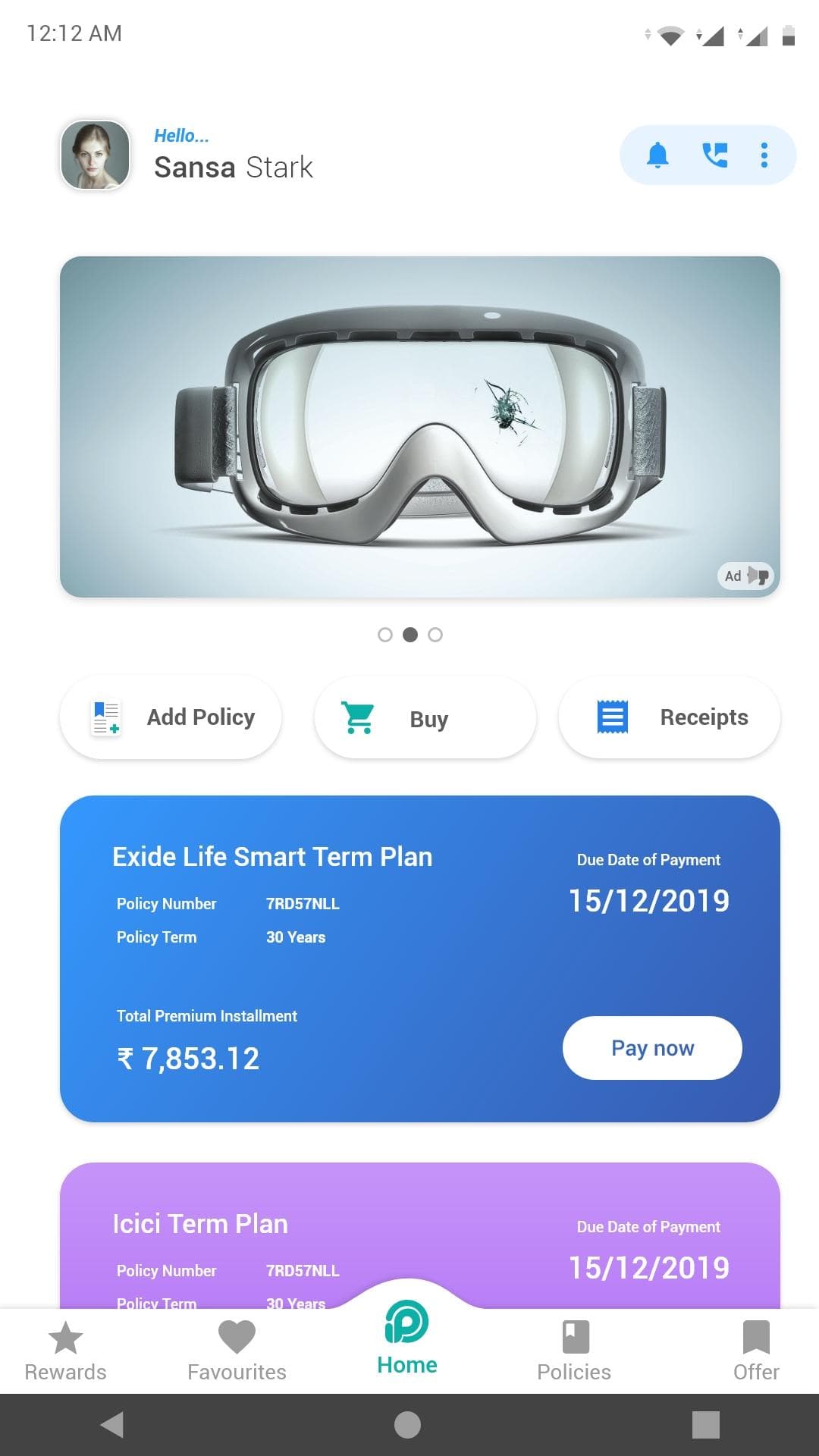
Every policy, its premium, and its due date on one screen.
Earn
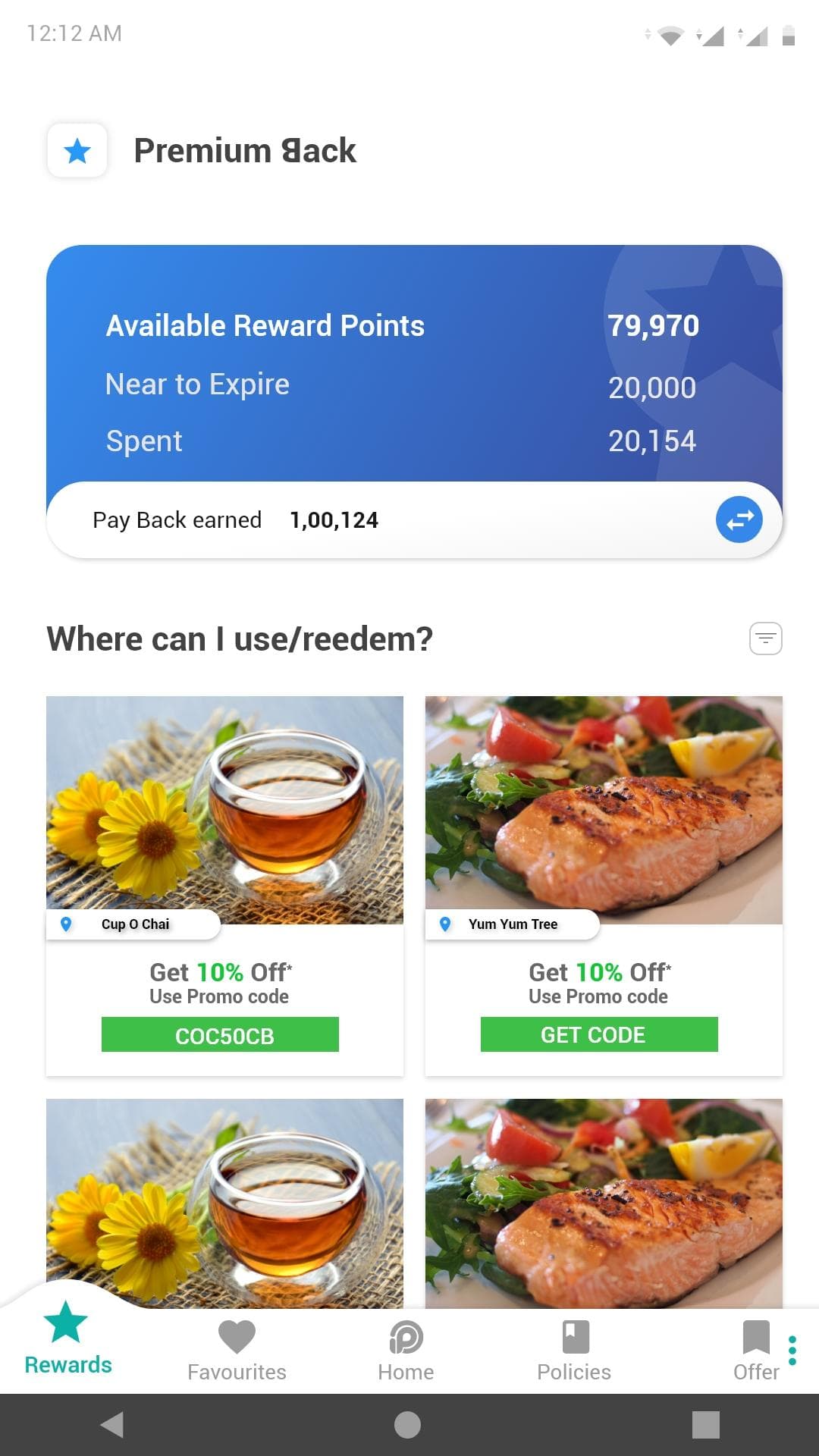
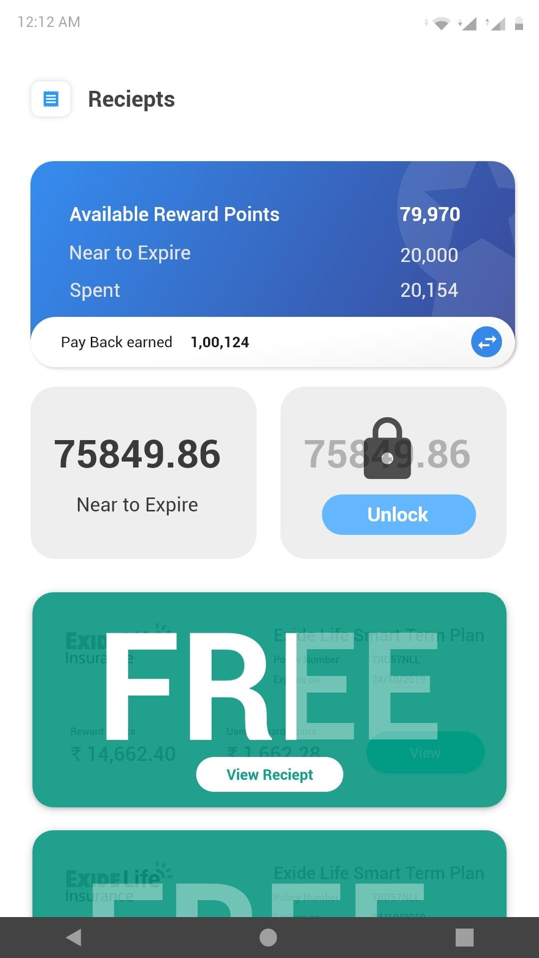
What was credited, what is near expiry, what has been spent.
Spend
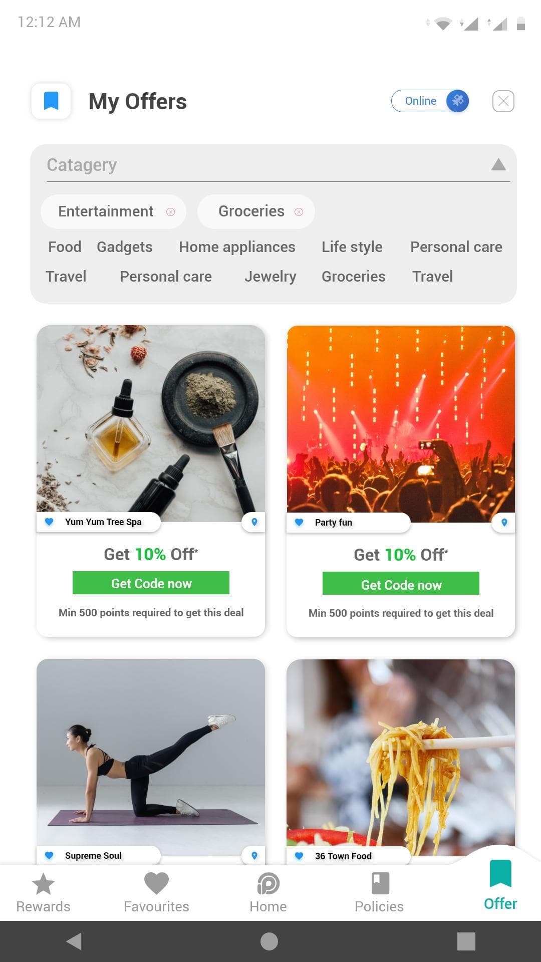
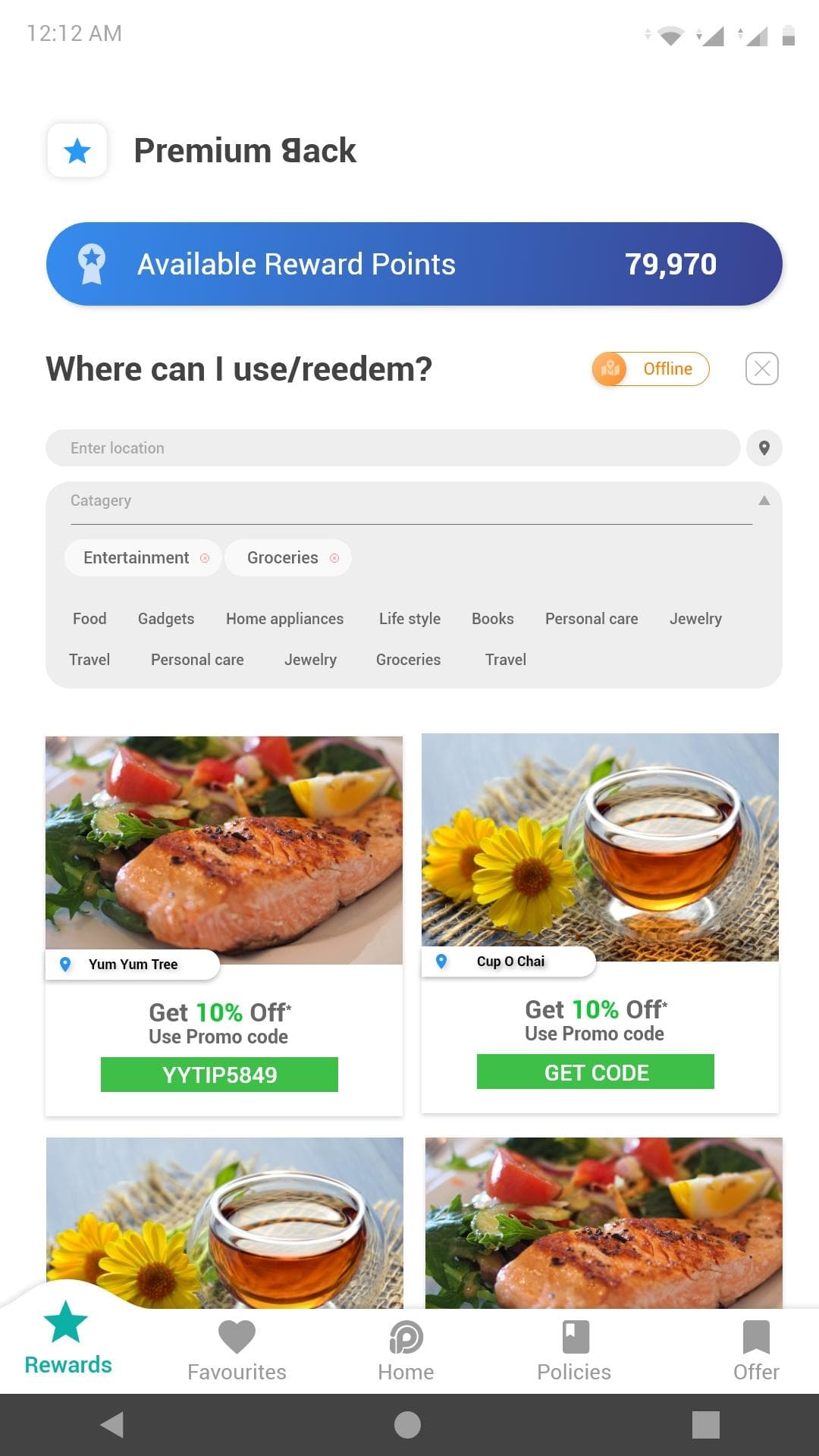
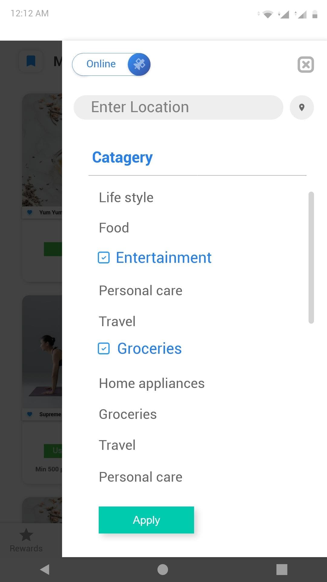
Where the points can actually go, and how far they reach.
From policy to payoff, and back again.
- Add policy
- Pay premium
- Premium back: 100% credited
- Where to redeem
- OnlinePartner stores
- OfflineMerchants near you
- Coupon
- Spend, then the next renewal comes round
Most payment flows end at the receipt. This one loops: spending the reward is what brings someone back to the next renewal, which is the only reason the cashback exists.
Cashback shouldn’t feel like a footnote.
Available
What can be spent right now.
Near to expire
The nudge that makes points behave like a deadline rather than a balance.
Spent
Proof the reward was real, which is what makes the next one believable.
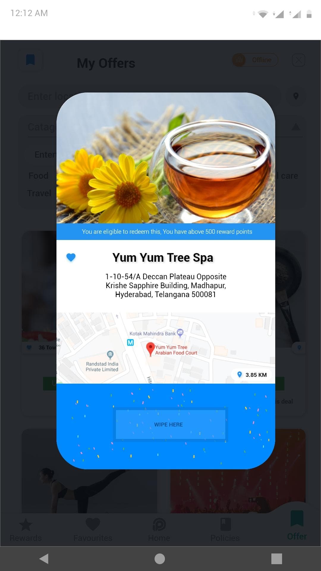
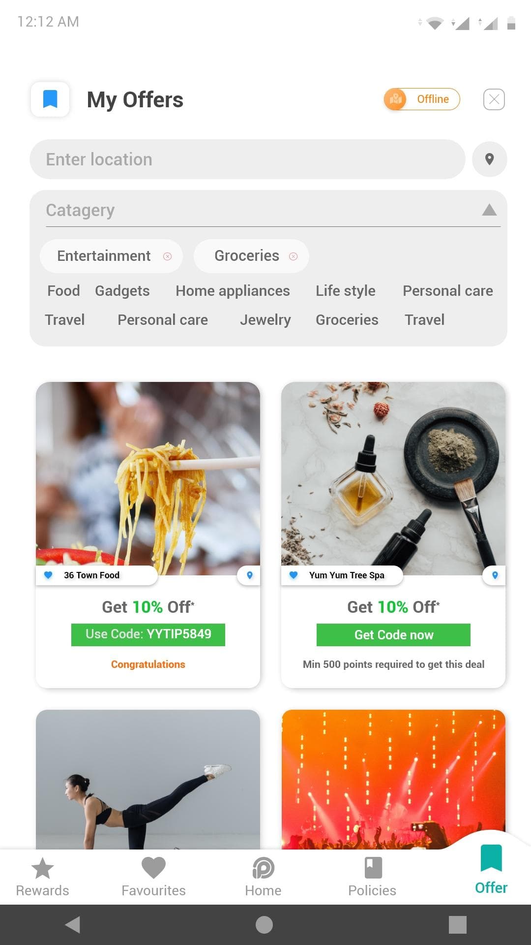
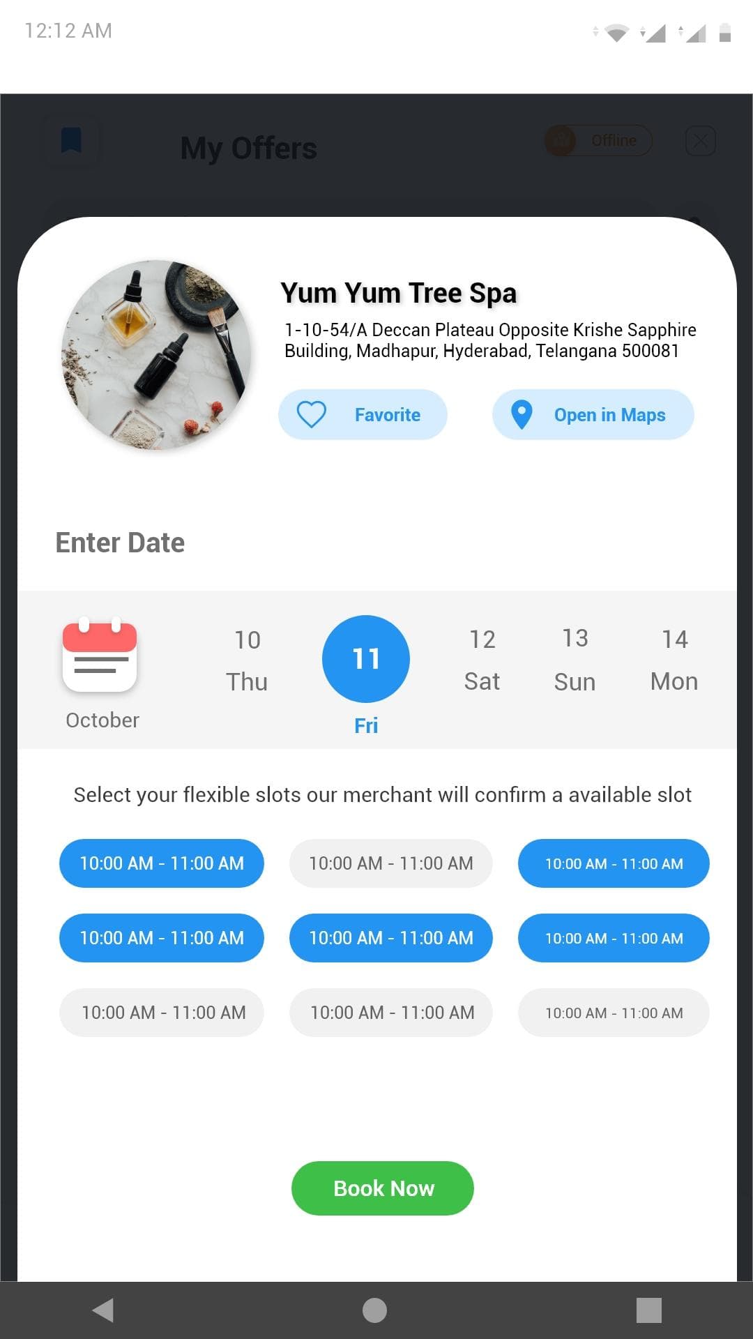
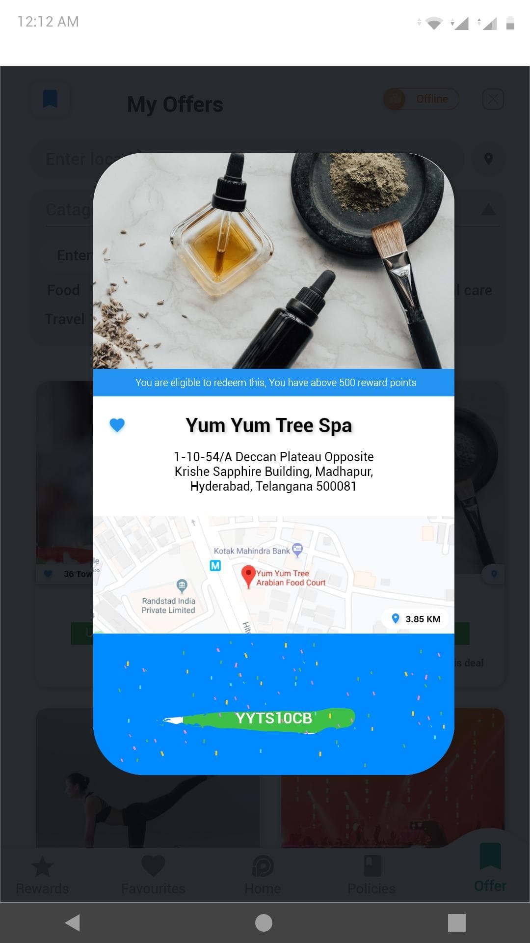
Redemption had to work in two directions at once: a code for an online basket, and a coupon someone could hold up at a counter. The offline half is why location and category filtering carry as much weight as the offer itself.
The first version wasn’t the final version.
- Signup was smooth, and the cashback was clear
- One-click renewal and automated reminders were called out as helpful
- Mobile-first layout and the dashboard read well
Policy comparison wasn’t clear enough
Users couldn’t tell policies apart quickly enough to choose between them.
Cashback progress was hard to see
People wanted to know where they stood, not just what they had.
Response time drew complaints
Auto-renewal was appreciated, but the app felt slow around it.
Trust needed to be visible
Testimonials and reviews were asked for by name.
3 apps.50+ screens.One connected idea.
- 3
- 50+
- 100%
- 2
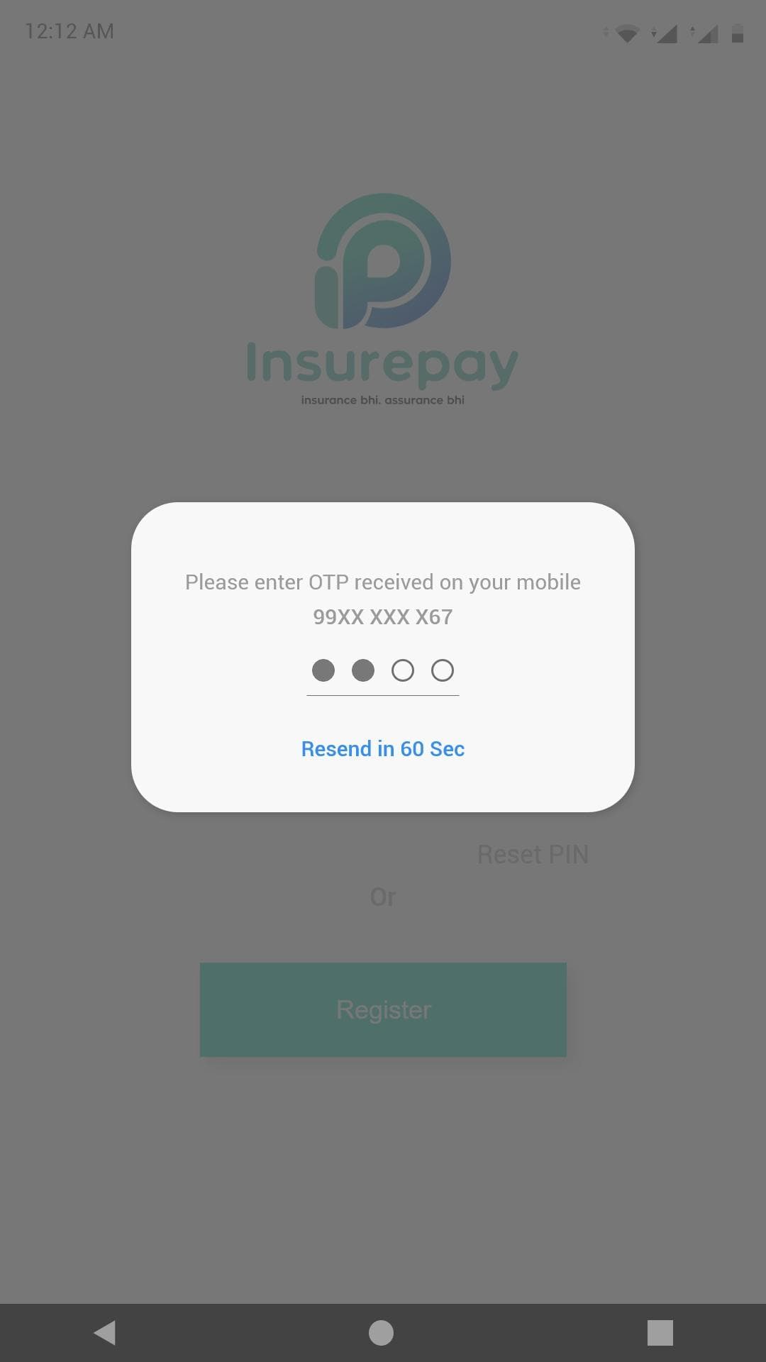
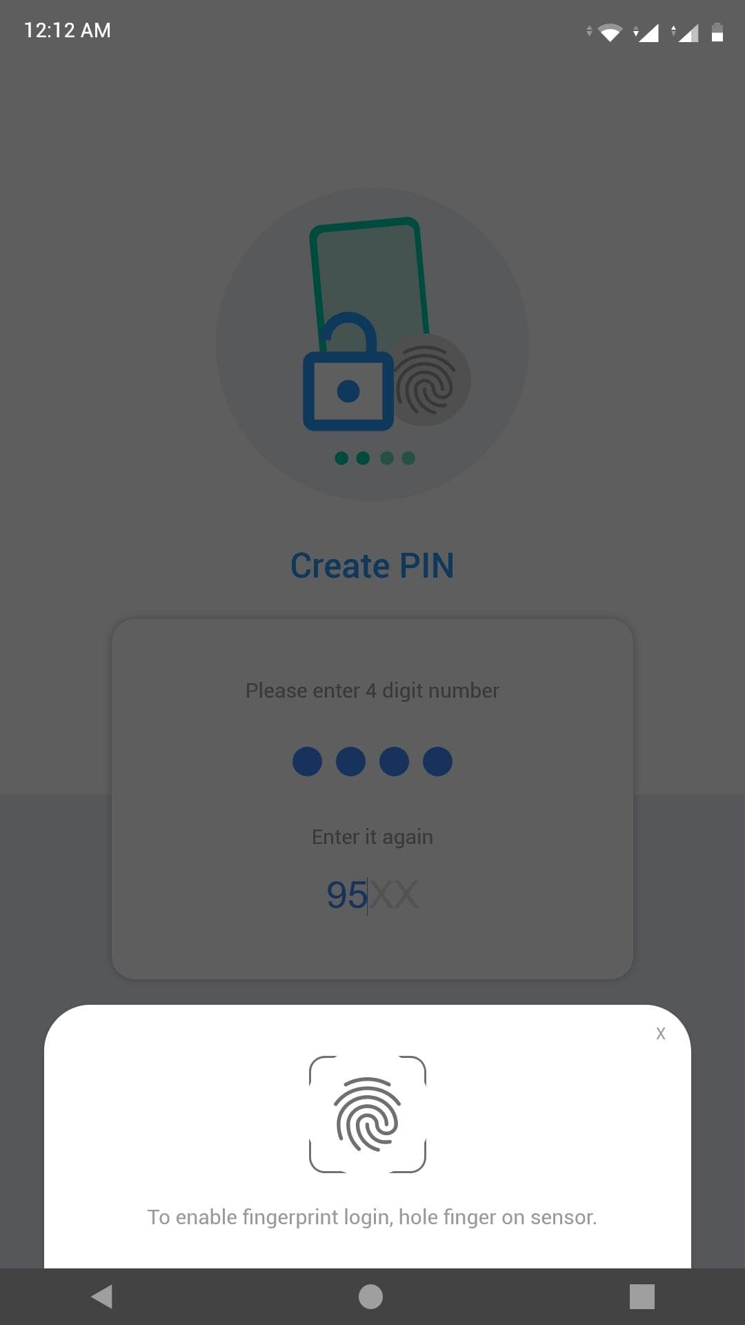
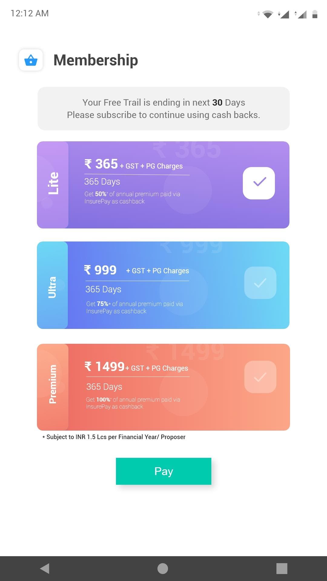
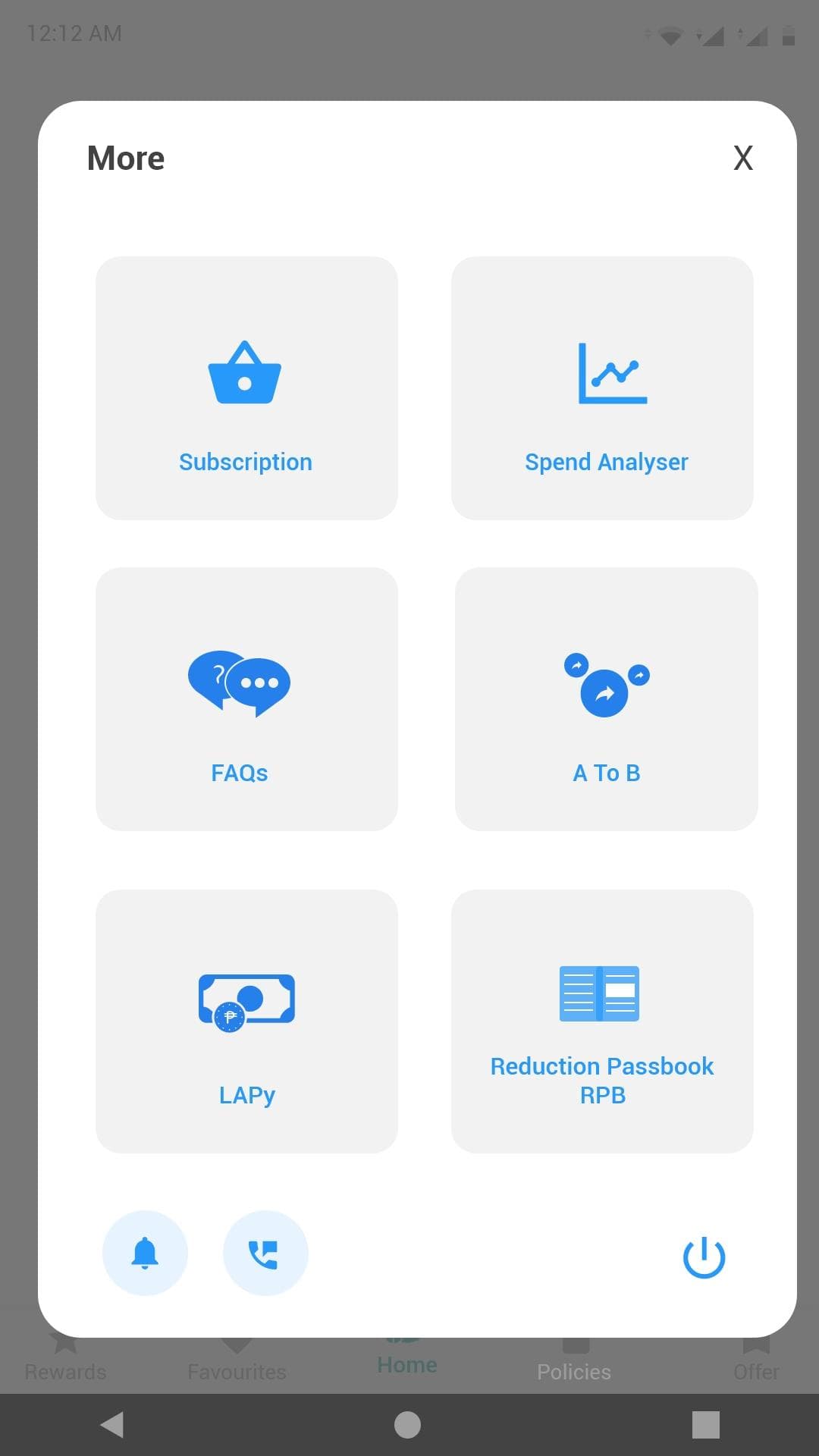
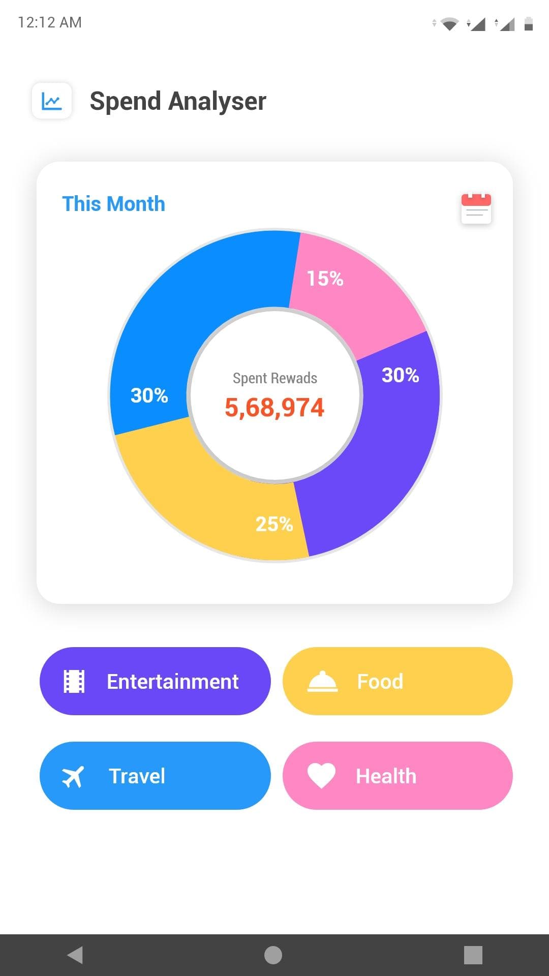
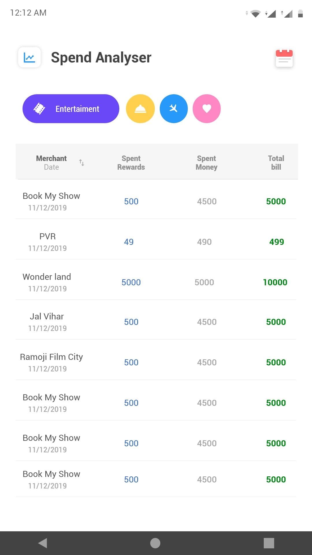
The archive covers onboarding, policies and payment, rewards and redemption, spend analysis and support. The source records three apps but never names them, so these are grouped by what they do rather than by a product name I’d have had to invent.
Strategy wasn’t separate from design.
I was the experience designer on this, responsible for the strategy as well as the visual design. That meant the cashback mechanic and the screens it produced were the same piece of work. I couldn’t hand the idea to someone else and style the result.
- Research
- Strategy
- Architecture
- Flows
- Visual design
- Prototyping
- Testing
Give people a reason to come back.
Sometimes the job isn’t removing a problem. It’s giving someone a reason to come back.
The premium was always going to be paid. The design question was what the person got for showing up.