Back to top
← Selected work

Case study 04

Holland & Barrett

Bringing an established wellness brand online in India: a buying journey that had to respect a style guide it did not get to write.

Areas
UX · UI · Identity · Branding
Also
Prototyping · Responsive UI
Years
2018 to 2019
Market
India
Team
Self-directed, social media, stakeholders
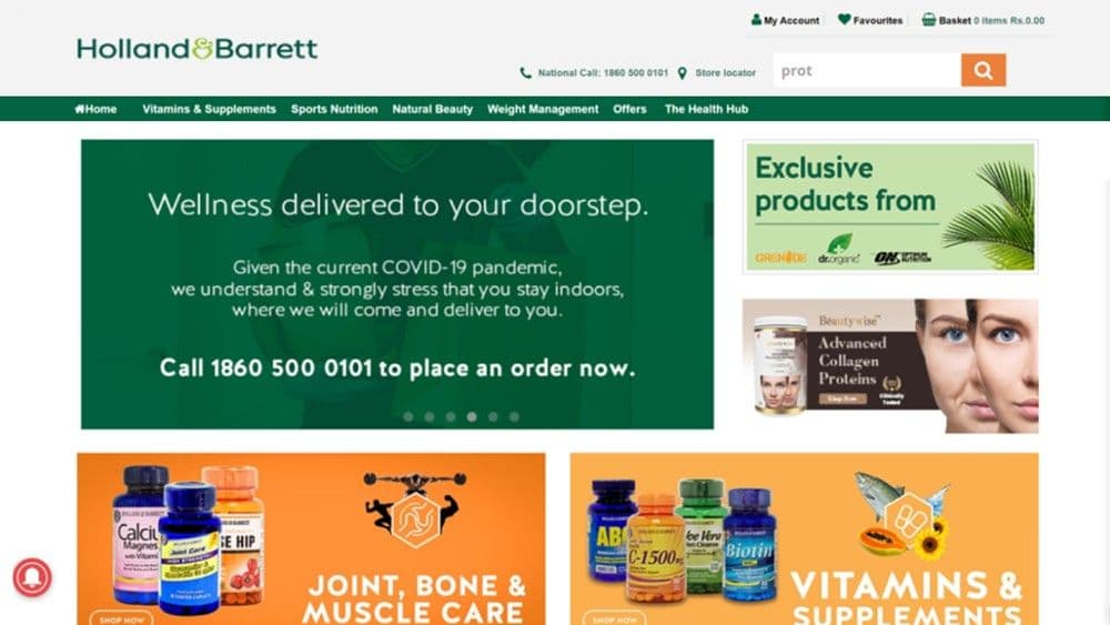
The Holland & Barrett India homepage: the wordmark and utility bar above a green navigation strip reading Vitamins & Supplements, Sports Nutrition, Natural Beauty, Weight Management, Offers and The Health Hub, with a wellness delivery banner and category promotions below.
Homepage · Holland & Barrett India

(The challenge)

How do you bring a wellness brand online without losing what makes it the brand?

To develop an online presence and buying journey, while respecting the existing style guide for Holland and Barrett.

The brief, as written at the time

The brand already existed, and it was not mine to reinvent. The job was everything around it: how someone arrives, finds a product, understands it and buys it, all inside a visual language that was already set.

(The opportunity)

More than a shop.

Shop

  • Products
  • Search
  • Purchase
  • The journey

Discover

  • Wellness
  • Healthcare
  • Education
  • Content

The experience had to help people buy, and understand what they were buying.

Holland & Barrett was new to India, awareness was low, and the customers ranged widely in age. A shop alone would have asked people to already know what they wanted.

(The buying journey)

Make the path to the product feel familiar.

SearchType what you knowShop by productVitamins · minerals · herbalShop by conditionImmunity · sleep · jointsCategoryProductBasketCheckout
  1. Three ways in
    • SearchType what you already know
    • Shop by productVitamins, minerals, herbal remedies
    • Shop by conditionImmunity, sleep, joints, skin
  2. Category
  3. Product
  4. Basket
  5. Checkout
The Health Hub
Articles running alongside the catalogue, not after it
  • 01

    Observation

    People arrive already fluent in other shops.

    Response

    Use the patterns they have already learned: a search field where they expect one, filters on the left, a basket at top right. Learnability is mostly a matter of not being novel.

  • 02

    Observation

    Not everyone arrives knowing the product name.

    Response

    Give the catalogue a second door. Someone who knows they sleep badly should not have to work out which supplement to search for.

(Make discovery easier)

Finding the right product shouldn’t feel like work.

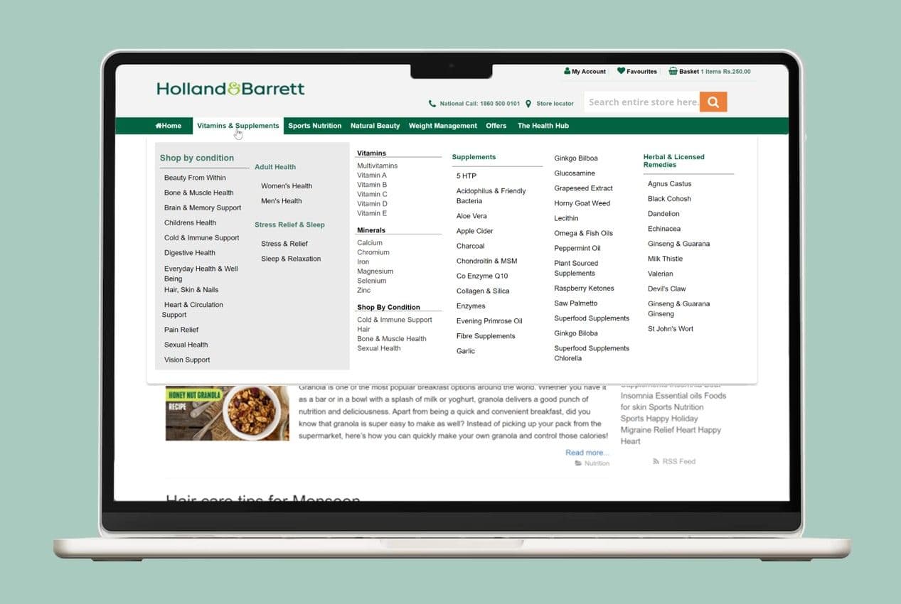
The Vitamins & Supplements mega-menu open on a laptop, with a Shop by condition column listing twelve conditions from bone and muscle health to vision support, beside columns for vitamins, minerals, supplements and herbal remedies.
Vitamins & Supplements · navigation
  1. 01

    Shop by condition

    Twelve routes in, named after problems rather than products: cold and immune support, pain relief, sleep, vision.

  2. 02

    Shop by product

    The same catalogue, indexed the other way: vitamins, minerals, supplements, herbal and licensed remedies.

  3. 03

    One screen, both

    Neither route is buried behind the other, so the menu never asks which kind of shopper you are.

This one screen is most of the argument. A supplements catalogue is hard to search precisely because the person searching often can’t name the thing they need, so the navigation carries a second index, by condition, sitting level with the first.

(Brand → digital)

Take the brand with you.

  1. Style guide
  2. Visual language
  3. Interface
  4. Shopping experience

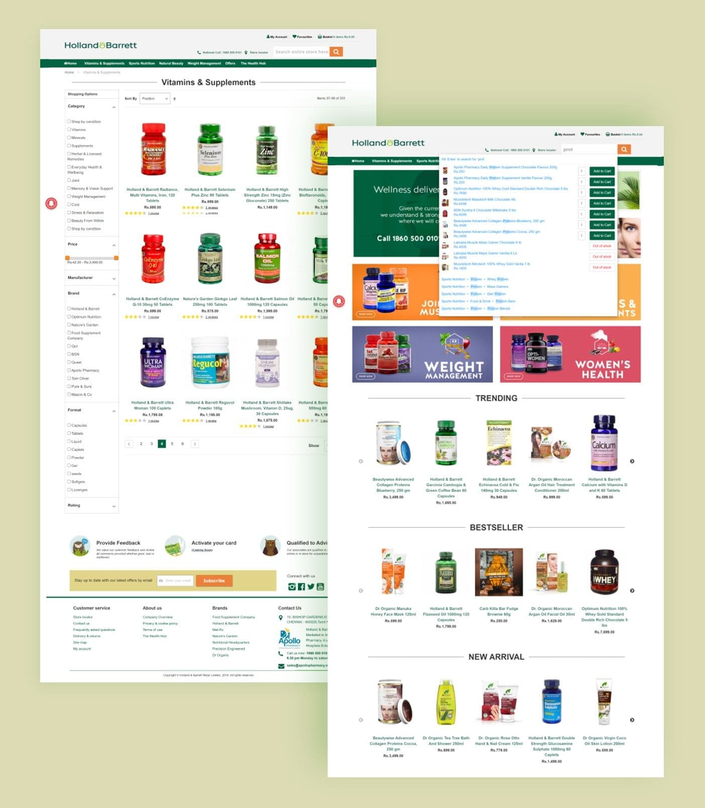
The green, the wordmark, the product photography and the tone were fixed. What was open was structure: what a row of products has to tell you before you click, how far a promotion can go before it crowds the catalogue, and where the brand should be loud versus quiet. The brand stayed put; the shop got built around it.

Two Holland & Barrett desktop pages: a Vitamins & Supplements category listing with filters and a product grid, beside a homepage carrying weight management and women's health promotions above trending, bestseller and new arrival rows.
Category listing and homepage

(The Health Hub)

Not everything starts with a shopping cart.

  1. 01Discover
  2. 02Learn
  3. 03Explore
  4. 04Shop

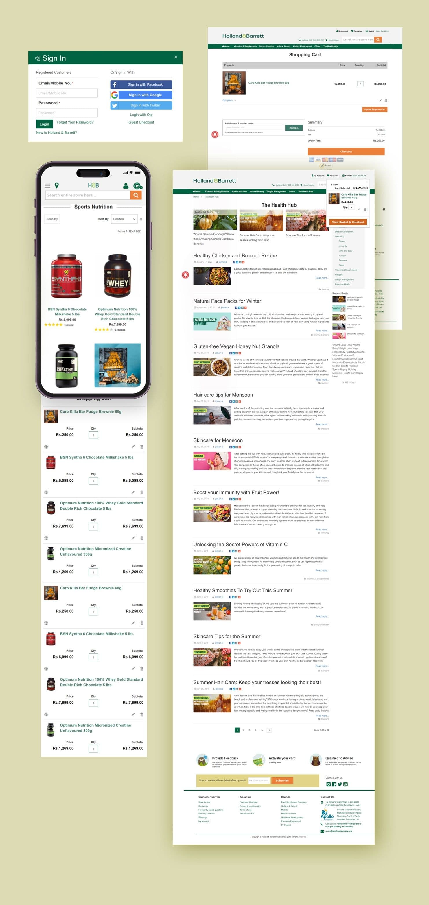
The Health Hub sits in the main navigation, not in a footer. Sixty-four articles (recipes, seasonal skincare, immunity, sleep) indexed by the same conditions the shop is indexed by, so reading about something and buying it are two steps of one thing rather than two different visits.
Indexed by

  • Diseases & conditions
  • Wellbeing
  • Fitness
  • Immunity
  • Mind and body
  • Nutrition
  • Seasonal
  • Sleep
  • Recipes
  • Weight management
  • Everyday health
Holland & Barrett screens: a sign-in dialogue with social and OTP options, a desktop shopping cart, a mobile Sports Nutrition listing, and The Health Hub article index with featured posts, recipes and seasonal wellness pieces.
Sign in, cart, mobile listing, and The Health Hub

(The responsive experience)

Same brand.Different screen.

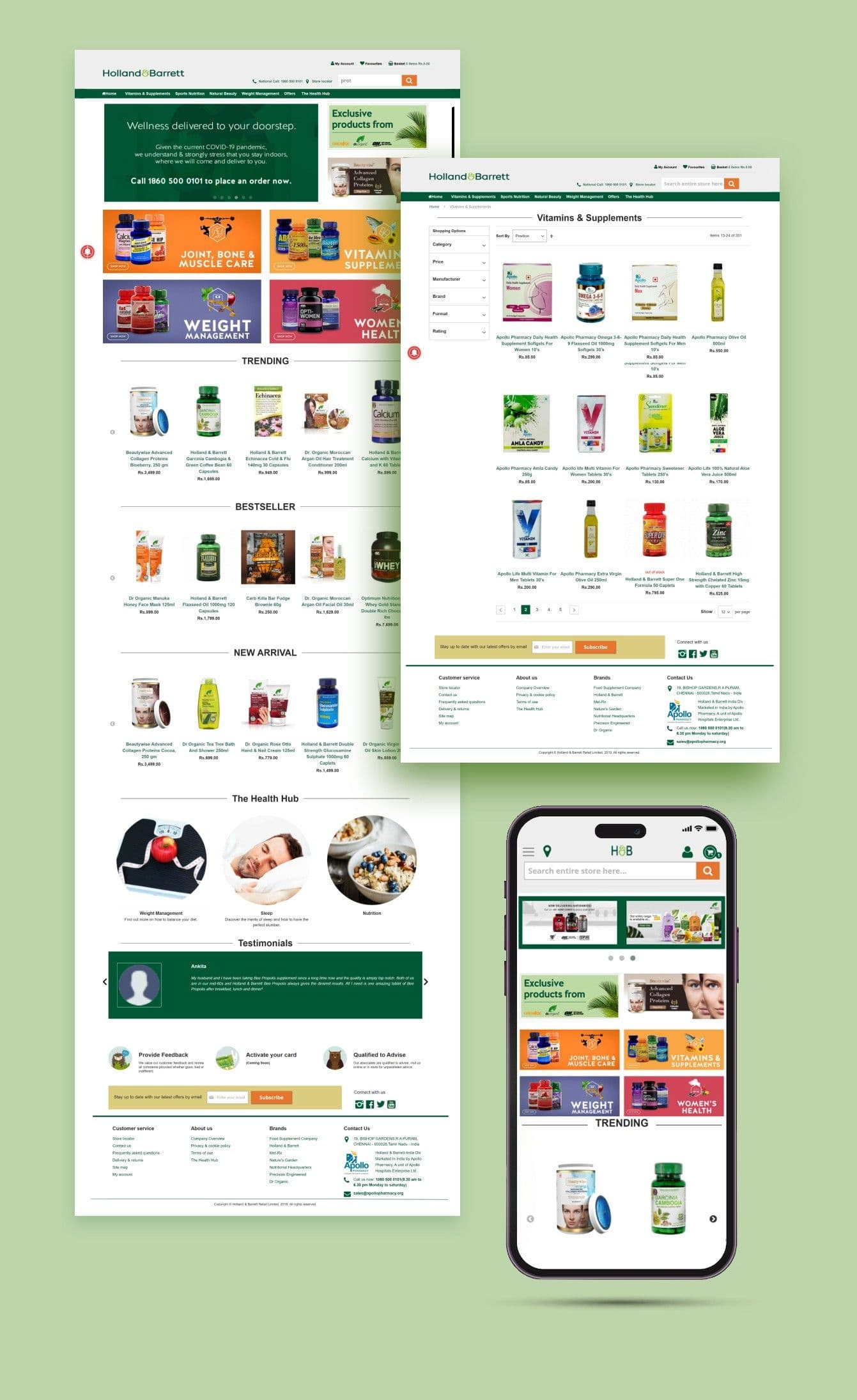
India was a mobile market and the brand was new to it. The phone was not a reduced version of the desktop site. It was where most of the first impressions were going to happen.

The Holland & Barrett experience across screens: the desktop homepage and a category page beside the same experience on a phone, with the Health Hub content cards below.
Desktop and mobile
  • 01

    Navigation

    The mega-menu's two indexes collapse into a single drawer without losing either one.

  • 02

    Discovery

    Filter and sort stay reachable above the grid instead of moving off-screen.

  • 03

    Purchase

    The basket and its running subtotal follow, so the commitment is always visible.

(Areas of contribution)

Not just the interface.

The published project lists the areas I worked across. It was self-directed, alongside social media managers and stakeholders, so the brand, the experience and the interface were one continuous piece of work rather than a brief handed down in stages.

  1. Brand
  2. Experience
  3. Interface
  4. Prototype
  5. Responsive
12
Shop-by-condition routes
64
Health Hub articles
2
Ways into the catalogue
1
Brand, unchanged

(The takeaway)

Help people find what they need.

A good shop doesn’t only help people buy. It helps them work out what they need.


Which is the same problem as the other two: someone arrives without the vocabulary the system expects, and the design either closes that gap or leaves them to it.

An established brand, brought online.

What’s next?


© 2026 Upendra Rangoju