Enterprise Demand Management
A governance workflow used by more than 45,000 people, redesigned so each role sees only the part of it they own.

A governance workflow,at company scale.
An internal enterprise platform for demand management. Someone raises a demand, the system routes it to the approver who owns that decision, and an approved demand becomes a service request in a downstream system.
More than 45,000 people used it, in seven roles, on Power Apps, SharePoint and Power Automate. I led the UX design, from the workflow through to the interface.
45,000+ people.One experience for all of them.
A single demand could travel through seven hands before it closed.
Governance was not the thing to fix. Every approval level existed for a reason, and none of them could go. The structure was the problem: one interface served every role, so the information architecture followed the system’s shape rather than the person’s task, and each person had to work out which part of it was theirs.
- Requester
- System assignment
- Approver
- Decision
Four stages, in a straight line. That version of the workflow fits on a slide, and it is the version almost nobody experiences.
What that cost the people using it.
Relevance was the reader’s job
Every role opened the same navigation and the same record, so deciding what mattered came before the task could start.
Actions were harder to find
The ways a demand can leave an approver’s hands sat among fields that approver never filled in.
The process had to be learned first
You had to understand how the governance worked before the product made sense. Recall was doing the work that recognition should have done.
Every handoff was a place to wait
A demand could move through several people and multiple approval levels, and each one added somewhere for it to sit.
- Requester
- System assignment
- Approver
- Decision
- ApproveSR initiator → External system
- Refer backReturns to requester
- RejectEnds
- ExceptionCU L2 → CU L3 → CU L4
Approve is one of four outcomes. Refer back returns the demand to the requester, reject closes it, and an exception climbs a three-level review ladder. Every one of those paths is a different screen for a different person, which is the whole design problem in one picture.
The problem was not the interface’s complexity.It was the distance between the system’s structure and the person’s context.
What success had to look like.
No target number was set for the redesign. The goals were about the experience; the measure came afterwards.
Show each role its own work
Open the product and see the demands you are responsible for, not the whole system.
Put the decision where the information is
Whatever a person has to decide should sit with the record they are deciding on.
Let the system carry the deadlines
Routing, reminders and SLA are the system’s job, not something a person has to remember.
Understand the system,then the people in it.
Workflow mapping
The demand end to end: every stage, every branch, every person it passes through.
User research
Talking to people in each role, and looking at how they actually moved a demand along.
Personas and roles
Each role written down as a persona: its goal, its context, and what it needs to act.
Information architecture
Testing whether navigation and the record were organised around the task or around the system’s modules.
Task-flow analysis
Walking the core tasks to find the steps, screens and decisions that were not earning their place.
Synthesis
Findings agreed with the engineering team and stakeholders, then ordered by what to change first.
Different personas.Different contexts.
Seven roles use this workflow, and each one arrives with a different goal, a different amount of context and a different next action. A requester wants to know where their demand stands. An approver has a decision in front of them. An SR initiator needs the approved demand and the fields to raise the service request.
That is the whole design problem: the same product, for people whose work has almost nothing in common.
- Persona
- Goal
- Context
- Task
- Information
- Action
The same experience was trying to serve everyone.
Information overload
One record, every field, for every role. The interface asked each person to filter it themselves.
Role and context mismatch
The structure followed the system’s modules. People arrived with a task.
Dependence on system knowledge
Confidence came from knowing the process already, which is a poor thing for a product to require.
Too many handoffs
A demand could move through several people and multiple approval levels before it closed.
Design around the person, not the system.
The system knew what role you had.The experience should too.
One workflow.Four experiences.
One navigation, every module, the same record for everyone.
The role sets the navigation, the record shows the stage, and the actions belong to the decision in front of you.
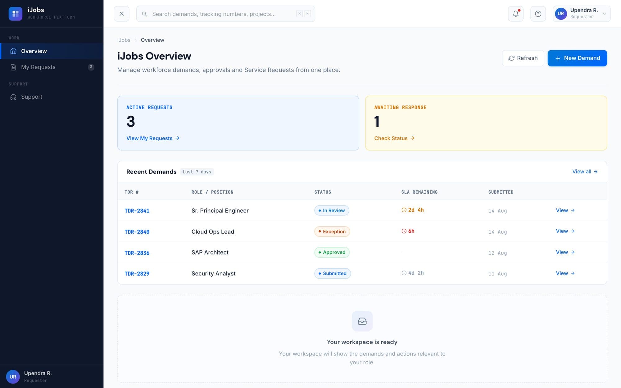
Sees what they need.
Raise a demand, then track where it sits. Nothing about approval mechanics they will never touch.
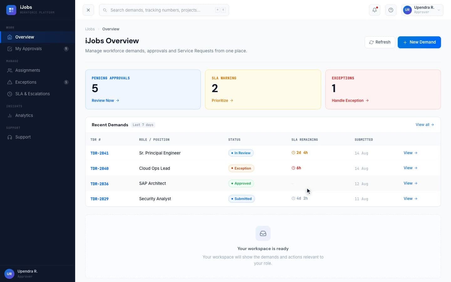
Sees what they need to decide.
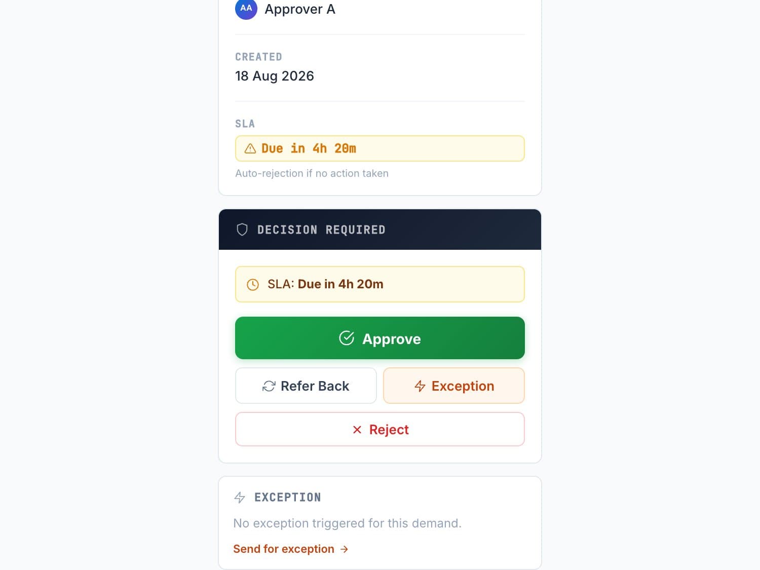
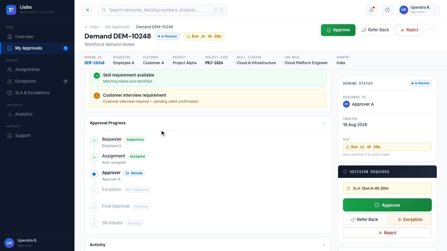
The record, the history, and the four actions (approve, refer back, reject, raise an exception), grouped around the decision itself.
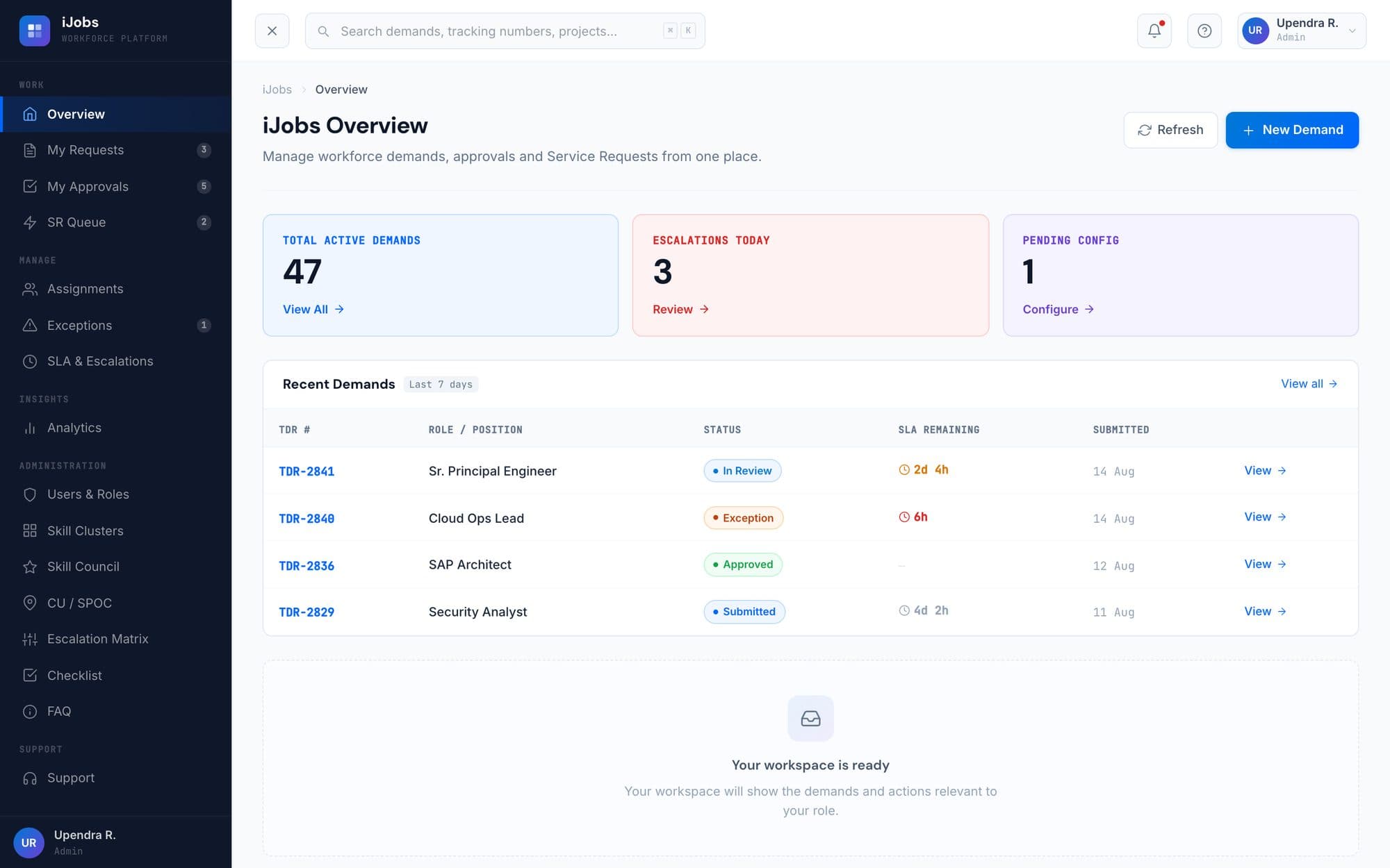
Sees what they need to manage.
Queue health, reassignment, and the override path when a demand stalls where it shouldn’t.
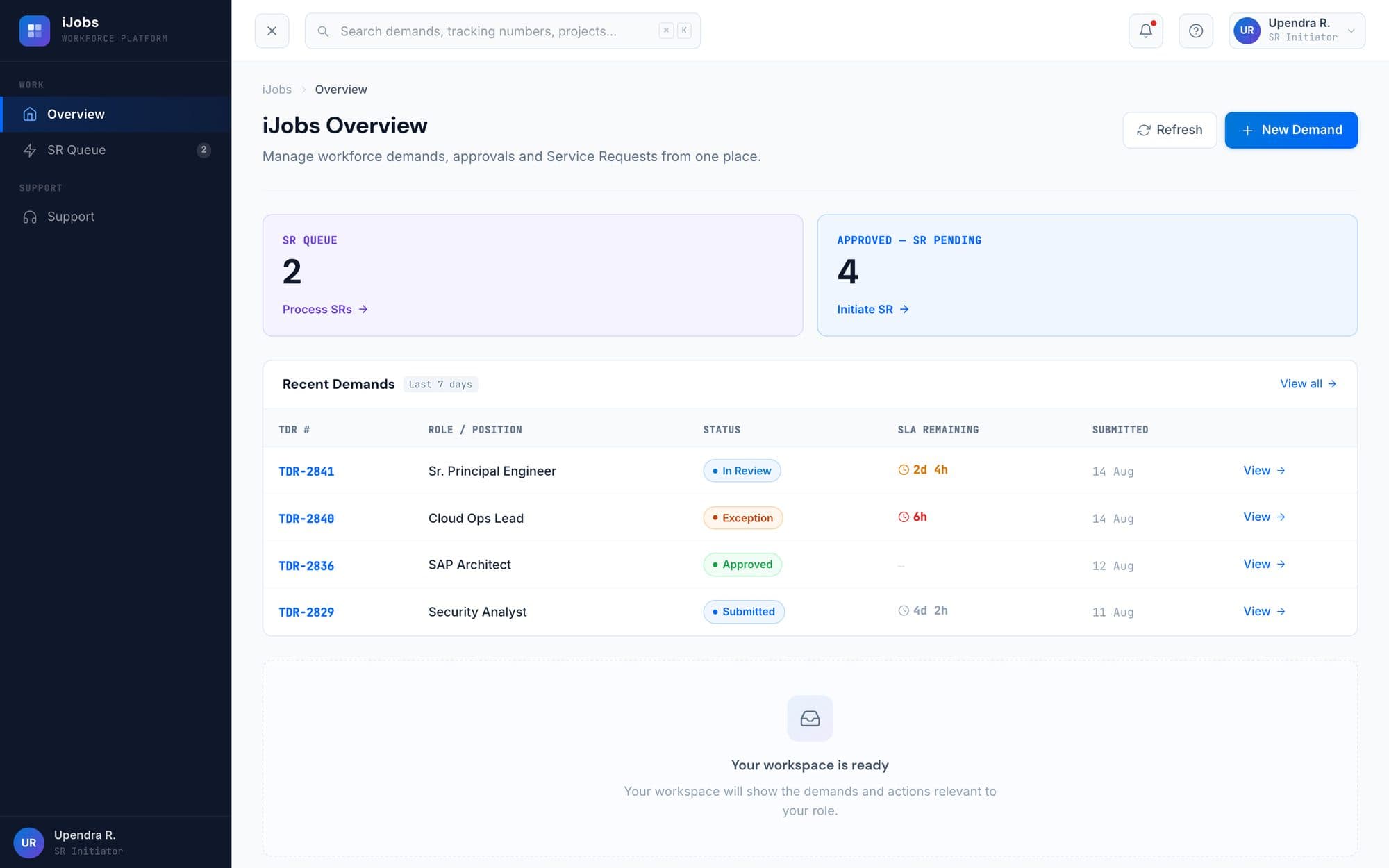
Sees what they need to execute.
The approved demand and the fields required to raise the service request downstream. Nothing upstream.
Same product. Same governance. Different context.
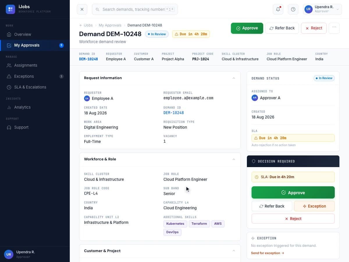
Designing the decision,not the form.
Context
The form surfaces the information relevant to the current stage, not all thirty fields at once.
Decision
Approval actions are grouped around the decision the user actually has to make.
History
Previous actions stay visible instead of disappearing into the workflow.
Validation
Anything that blocks the next action is surfaced before the user commits to it.
Role
The experience changes depending on what the person needs to accomplish.
Auto assignment
Notifications
Reminders
SLA tracking
Reassignment
Exception workflow
Auto-rejection
I designed the experience around the automation: what it should surface, when it should interrupt, and what it should never ask a person to remember. The flows themselves were built in Power Automate by the engineering team.
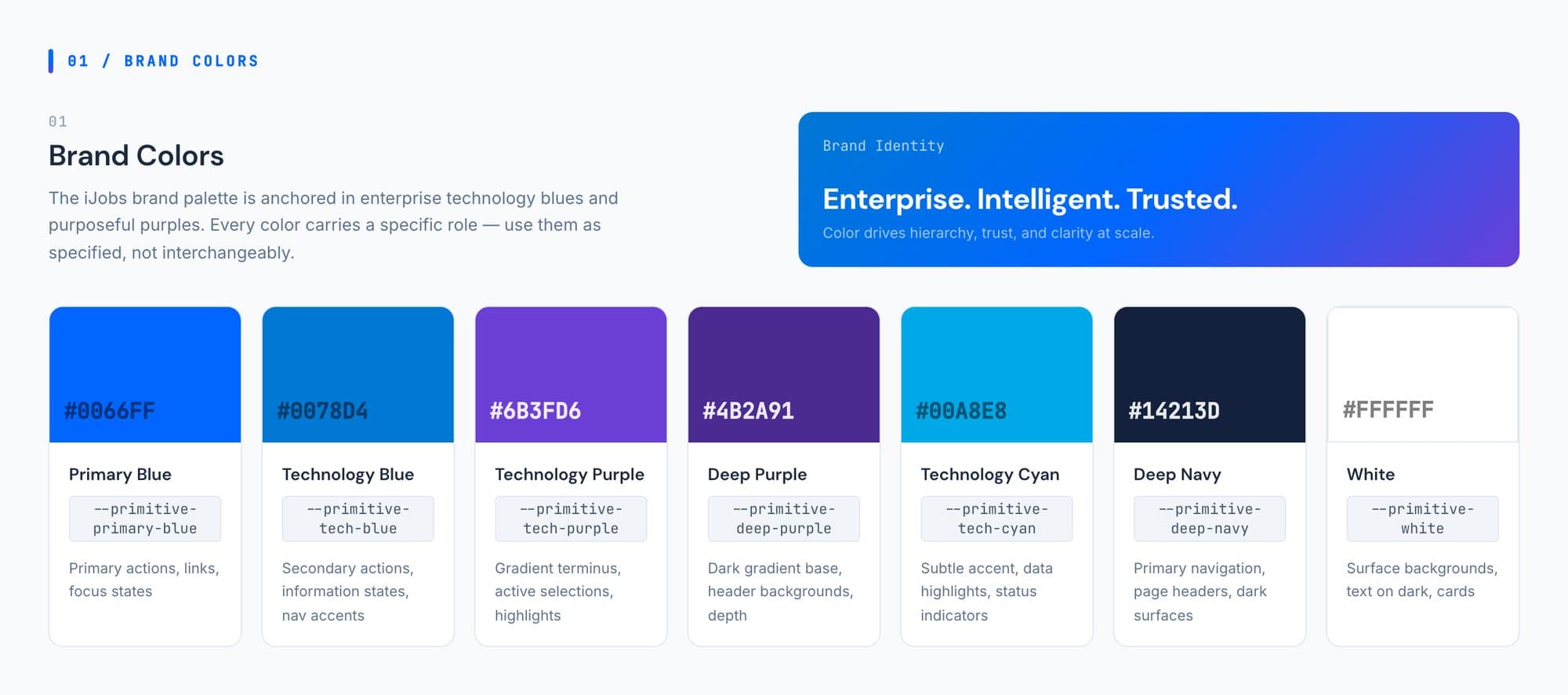
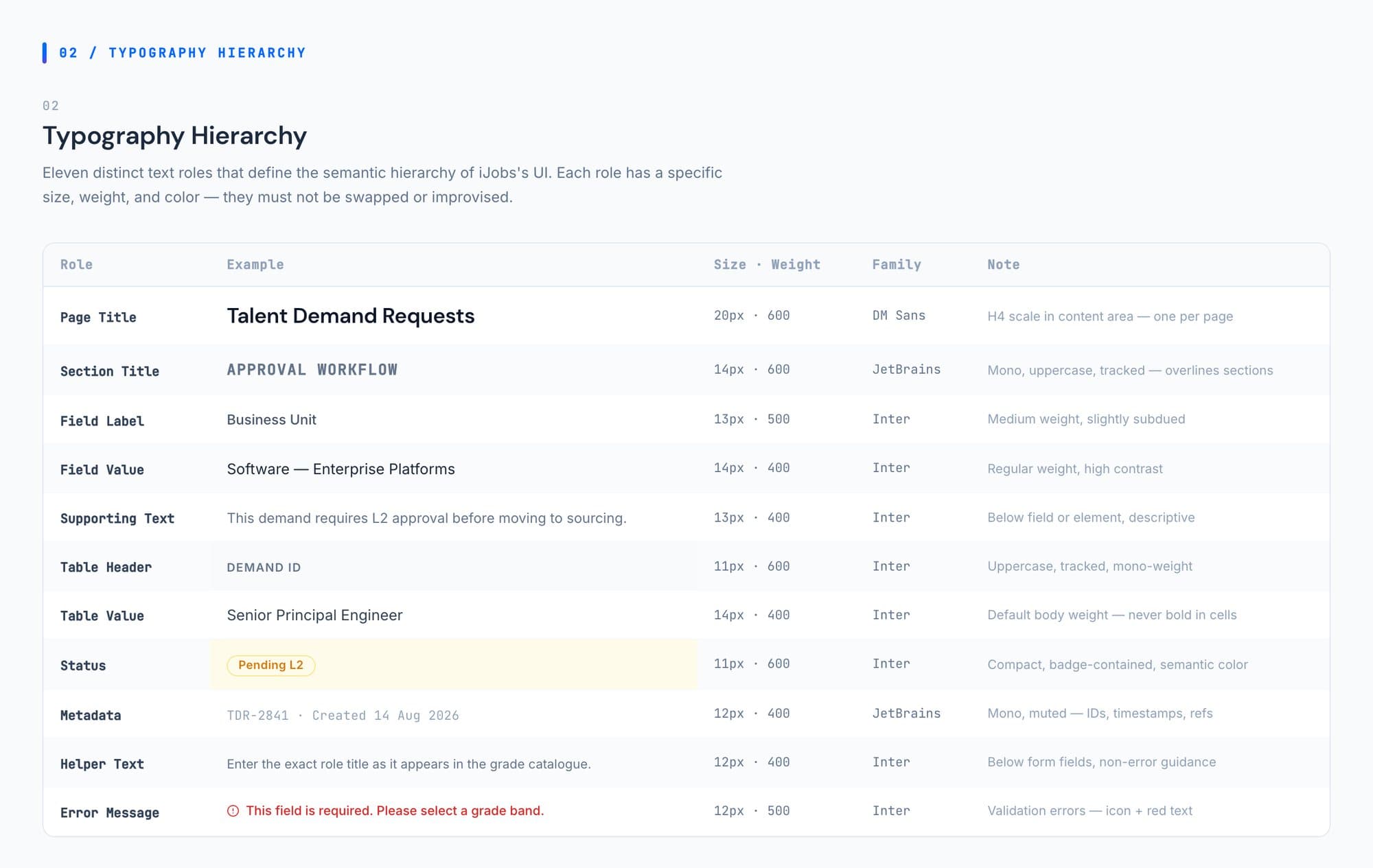
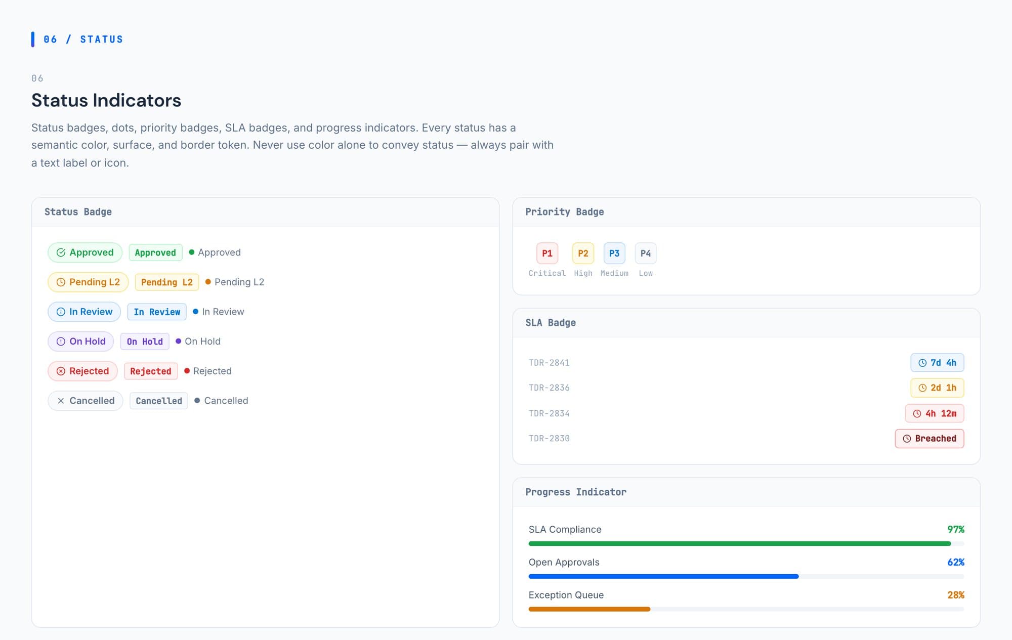
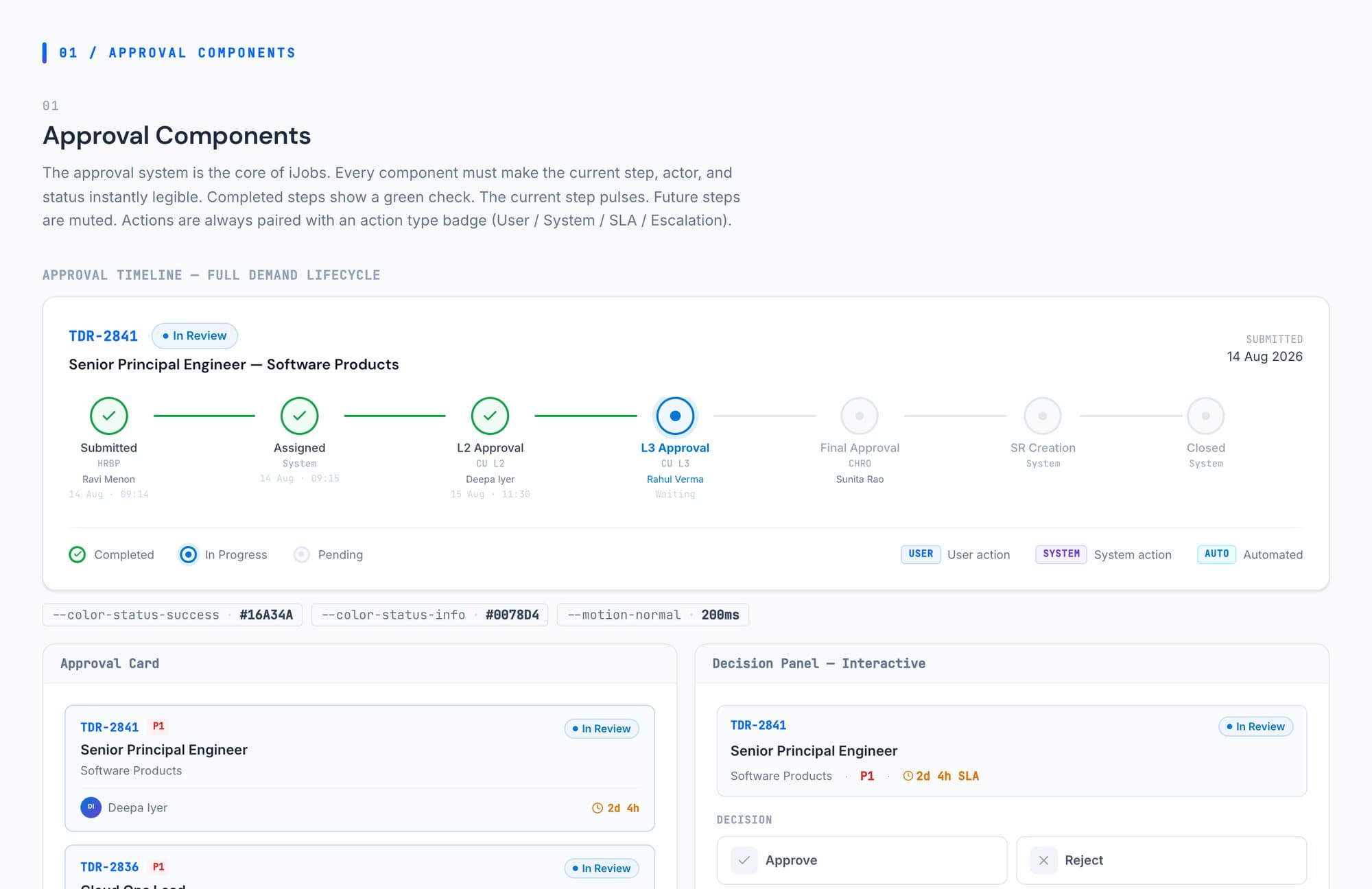
Underneath the screens is one design system: brand colour, tokens, type and components defined once, then reused by every role’s view and every state a demand can be in.
Prototype. Test. Refine.
The role views and the decision screens were prototyped and reviewed with stakeholders and the engineering team, then tested with employees working through their own tasks.
Each round came back to the same three questions: what does this role need to see, what decision is being made here, and what should the system remember so that nobody has to.
- Prototype
- Test
- Observe
- Refine
Scale unchanged.Experience rebuilt.
- 45K+
- 7
- 7%
- 1
For the people using it
Each role opens the product on its own work, and the decision sits with the record it belongs to.
In the product
One connected workflow, a view per role, and an automation layer that does the routing, the reminders and the clock.
Measured
Adoption improved by 7%. It is the one number this project measured, so it is the only one here.
From a shared enterprise portal to an experience that understands who is using it.
I wasn’t handed a screen to design.
I worked across the problem: understanding the workflow, shaping the experience, designing the interfaces, and working through how the product could actually operate in production.
- UX strategy
- Information architecture
- Interaction design
- UI design
- Prototyping
- Validation
- Design system
What this one taught me.
Enterprise software rarely fails because it cannot do enough.It fails when it leaves every person to work out which part of it is theirs.